If you are the face and voice of your brand, or the key reason why people choose to work with your company, then people need to see you and know what you look like.
You can't hide behind your work, or bury your photo on the About page of your website.
You have to truly step forward and allow yourself to be seen.
So let's talk about what it takes to capture WHO YOU ARE in your signature photos.
The best signature photos tell a visual story of who you are. They allow your visitors to almost feel like they know, like and trust you in a single glance, paving the way for a deeper level of connection and relationship. And they align with your message, your brand and how you want to show up.
There are of course a couple approaches you can take.
The first approach is all about capturing your core essence and your energy. I call this approach the "Transformational Leader" because it's taken by a lot of transformational leaders who have a personal development, conscious business or spiritual component to their work.
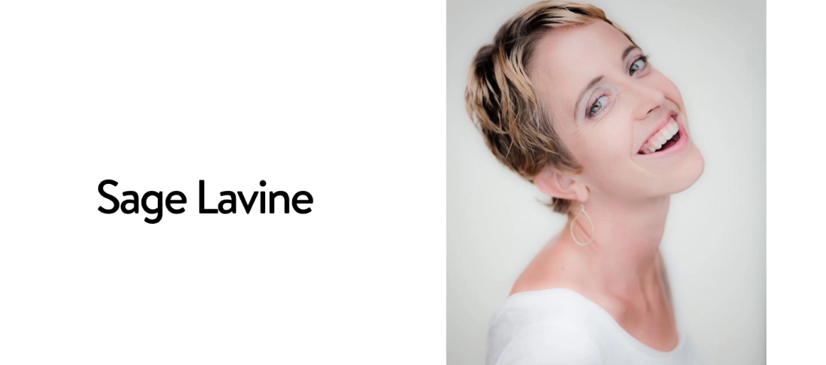
And one of the best ways to capture someone's essence and energy is by focusing on them - their eyes, the expression on their face - and stripping back anything that could distract from them like this portrait of my friend Sage Lavine.
Sage's photographer caught her in a moment of spontaneity with her head back and her mouth wide open in a smile that allows us to connect directly with her. The shot feels natural and authentic, rather than posed or contrived.
The focus is on her. Not her clothes. Not her accessories. Not her background. But her.
The first set of professional photos I ever had taken for my business -- that I used up until recently -- were actually done in a hotel room at an event. I didn't plan for the shoot or have a professional hair and make-up artist come in. I connected with a photographer at the event - Alannah Avelin -- who really put me at ease. The focus of these shots were on me, not my clothes, not my accessories, not the background, but me - the look in my eyes and the expression on my face.

A second approach is to focus more on lifestyle and fashion then your core energy and essence. I call the second approach The Lifestyle Leader because it's taken by more celebrity entrepreneurs who dazzle with their style, their sophistication and the lives they lead. In this approach where you are and what you're wearing become almost as important as who you are.
Think Oprah.

Or Marie Forleo.
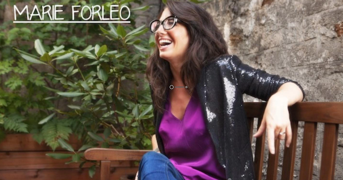
These two glamorous women are trendsetters. Their tribes admire them and they also want to be like them -- they want the clothes... and the lifestyle... and the personal stylist. So photos of Oprah and Marie Forleo tend to be wider shots that showcase their clothes and environment as much as they showcase them.
Oftentimes, the more well-known you become, the more interested people are in your clothes, your environment or who you're with. These are powerful cues that convey status and bestow credibility, while playing into people's curiosity about your life.
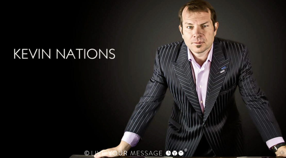
Another example of this for the men in the audience is Kevin Nations. Kevin is a well-known business coach who promises to help his clients make $50K and up a month. In other words, one of the key elements of his personal brand is the results he promises his clients.
So his signature photo showcases him in an immaculately tailored suit. His suit, his stance, and the determined look on his face all send a clear signal of wealth, power and prestige. These signals inspire entrepreneurs to invest $4000/month and up to be part of his elite mastermind and to have the privilege of attending events at his house in Vegas, which he refers to as Spa Nations.
Before we move on, take a moment to write down which approach you prefer for your signature photos.
What visual story do you want to communicate?
Is it more about your core essence and energy or your clothes and lifestyle?
If you decide the focus needs to be on you - your energy, the expression on your face -- then I recommend going the route of Sage Lavine and having your photographer take a single portrait of you that feels more spontaneous. More of a close up or head and shoulders shot where you are the primary focus of the image.
If your physical appearance, your lifestyle or the big results you promise are more important, then try a wider environmental shot that provides more context or a series of photos that show different aspects of who you are.



Right now I'm in the process of relaunching LiveYourMessage.com and my new site design requires a photo banner on every page, which is giving me lots of opportunities to show my personality and make an impression.
Going into the shoot, I brainstormed specific shots that conveyed my principal brand idea - which is all about building a business that expresses who you are. I assembled clothes that captured my 3-word style statement, and even went hunting for photo props such as my old journals and my photography portfolio that revealed the most creative aspects of my life and personality in a real way.
After planning everything, I hired brand photographer Marshall Wayne to spend the day with me.
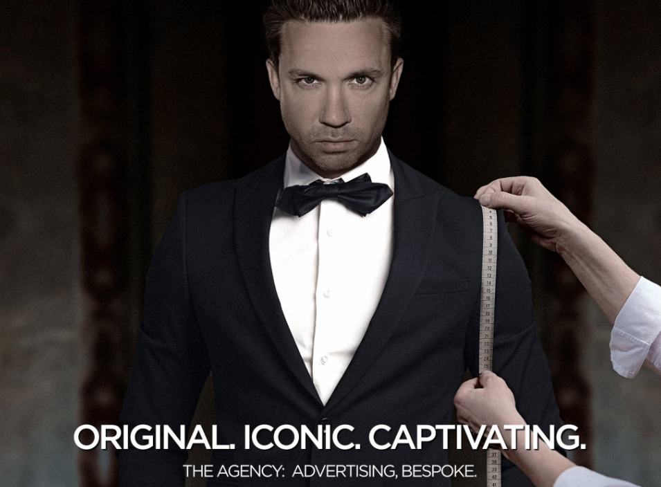
I chose Marshall because he's brilliant at taking environmental portraits that position people in the context of their lives and businesses, while still photographing them in a way that captures their energy and essence. While these new photos are more focused on lifestyle and fashion, I tried to take a hybrid of the two approaches I shared with you earlier.
Your signature photos are one of the best ways for people to see you and connect with you -- to look into your eyes and feel your energy. I can't tell you how many people cheap out on photography and how bad it looks when you lead with a crappy, poorly-lit selfie, especially if you want people to invest a lot of money in your products or services.
The other mistake people I see a lot is that people use an old, outdated photo of themselves. Even if you have an old photo that looks really great, if that photo no longer looks like you, it can create a disconnect with your audience when they finally meet you in person or watch one of your videos.
Since we all change and evolve so quickly, I recommend updating your signature photo every 2-3 years. It's really important that your photos reflect who you are TODAY, not who you were 5 years ago or who you were when you were 18, young and svelte.
Let me wrap this segment with a few tips for choosing a photographer and the types of photos you'll need for your website.
How to choose a photographer
This may sound obvious, but it's worth saying: choose a photographer whose portfolio already contains the kind of photos you want to have.
Lots of people make the mistake of going with a friend or hiring the local family photographer, assuming they're going to be able to direct that person to take the kinds of photos they want.... And they end up disappointed.
I recommend choosing a photographer whose style naturally matches what you're looking for. You may have to pay more. And travel may be involved for one or both of you, but it's well worth the investment to get photos that really represent you.
While you can hire a photographer and go into their studio, you can also have your photographer come to you. Have them take a picture of you in action in an environment that makes you feel comfortable and empowered -- whether that's speaking on stage or interacting with a client or simply at your home - so your energy and personality come across.
How to get the best result from your shoot
If you're shooting photos for your website there are a few special considerations that you'll want to keep in mind if you want your photos to be as versatile as possible.
- Make eye contact. In fact, most of your photos should have eye contact with your viewer. Even if your head or your body is turned. Make at least partial eye contact so your viewer feels the connection.
- Avoid covering your face with a hat. If you wear glasses everyday and they're part of your look, it's fine to keep those on, but try to avoid sunglasses unless you're going for a glamor shot.
- Next, you have to think about how you're going to use your photos on your website. In addition to asking for a standard head shot that crops right at the base of the neck, I recommend asking for a head and shoulders shot that incorporates your shoulders and upper torso.
That way your web designer has the flexibility to create a cut-out, where they remove you from the background of the photo, and place you on another background or banner such as this example we created for my client Cheryl Liew-Chng.

If you go for the standard vertical portrait that crops out your head and shoulders here's what happens. Either you include a photo cut-out where it looks like you have no arms or you have to put your image in a square or circle on your banners rather than having a more natural design that show more of you.

Or if you really want that headshot, ask your photographer to shoot landscape and position you either on the right or left side of the image so you can more easily turn this into a horizontal banner and use the image background as part of that.

I also recommend you take wider shots that incorporate half your torso, your entire torso or even your entire body. Those make for great photo banners on your website.
Finally, let me give you two pro tricks...
First, for all your landscape photos: make sure you're either looking straight at the viewer or looking into the photo. So if you're positioned on the right of the image, look straight ahead or in to the left. That way you'll be looking into the main content of your website rather than out at the edges.
Once you have good signature photos, you're going to want to use them everywhere -- from the home page of your website to all your social media profiles.
Second, keep your profile image consistent across ALL of your sites, social media platforms and other accounts.
This is because people will often start to recognize you from the one image you use on your social media profiles. It also allows people to instantly identify your content in a fast-moving newsfeed or tweet stream.
You can always use different photos in other places on your website, but keep your one signature profile photo consistent.
Finally, embrace your unique look
My students are often self-conscious about their looks and ask me what to do about their physical flaws and blemishes. Sometimes they feel too old or too bald or too fat or too something -- to step forward as the face and voice of their brand.
And my answer to them is always the same: Remember that your personal brand is all about being MORE of who you are. That means embracing who you are. Embracing your so-called imperfections. Embracing your age and embracing the wisdom that it gives you.
Because ALL of these features make YOU who you are and all of these features will INSPIRE your tribe to follow you.
While it never hurts to look your best - and I definitely recommend stepping it up when it comes to your wardrobe, your hair and especially your level of health, fitness and vitality -- you don't have to look perfect to be a superstar. You simply have to step forward with confidence and share your energy with the world.
