Now I'd like to turn our attention to writing headlines for the next most important web real estate you have -- your opt-in, squeeze & landing pages.
So let's dive in and talk about the kind of copy that squeeze pages really need to have in order to be most effective.
Here's a squeeze page I created for our Message to Money preview webinar that promises to teach "How to Triple New Clients and Sales" if you attend the event.
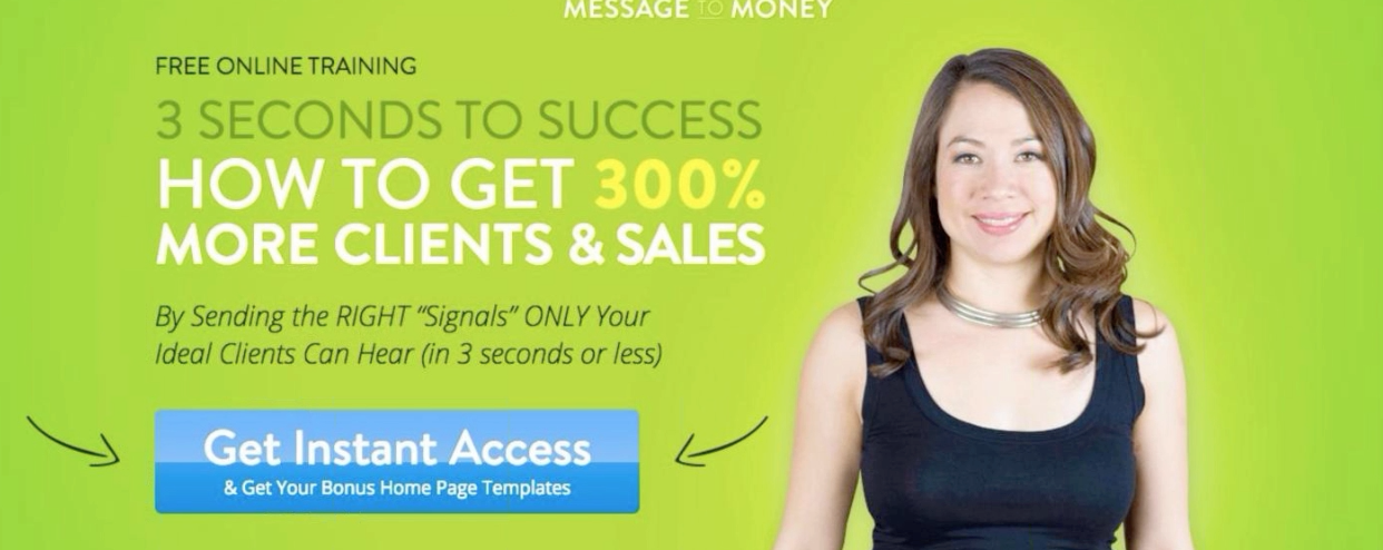
In contrast to an opt-in box that you put onto other pages like your Home Page or your Services or Blog page, an opt-in page or a Squeeze page exists ONLY to encourage and inspire a visitor to give me their email address. It has no other purpose in this world.
That's its only job.
So it has to be damn good at that job -- especially if you're paying for ads to drive traffic to that page.
And that's the reason why you see all these people putting in hours writing headlines and tweaking words, colors, buttons and layout to get their squeeze pages converting at over 60, 70 or even 80%.
They do this because -- and you might not know this -- it's because every single person is tracked all the way to the squeeze pages, and then through to its final sale, so in the end, the object is to be able to say that for each click that cost us $x, we made $y from it.
But don't stress -- you're probably not at that level yet -- and with what I'm going to share with you now, you're going to have some good tools to write a bunch of copy that will inspire more and more visitors to hand over their email addresses.
So - your squeeze page needs two basic things to do that -- a great headline -- and some excellent bullet points. That's basically it. You just need those two things and your squeeze pages can start putting butts on seats for your next webinar, building your list or whatever else you need it to do.
First, let's talk about the headline. We already covered headlines in quite a bit of depth in the last segment, but I want to add a few thoughts now about the specific kinds of headlines that, in my experience, work best on squeeze pages.
1. Go for what I call a "hooky" headline.
What I mean by that is a headline that grabs attention by making one specific promise to the visitor or solving one specific problem for them.
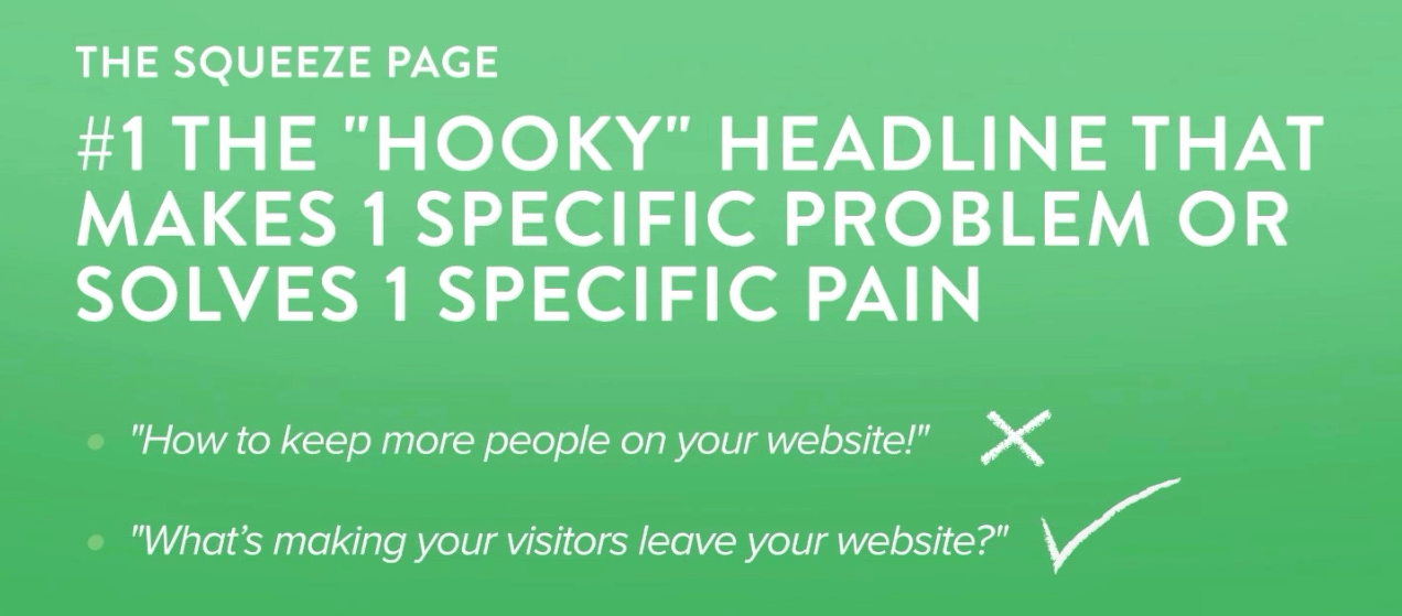
Here's what I mean by that -- remember our example earlier about "What's making your visitors leave your website?".
Note that the writer didn't say: "How to keep more people on your website!". He said "What's making your visitors leave your website?"
That's a LOT more specific. And when you can get specific about the very small but painful problem you're solving, more people will respond.
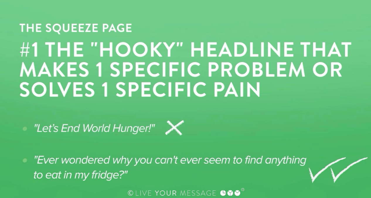
The thing to understand is that big general, important-to-the-world kind of problems that you may be trying to solve are very rarely, if ever, painful for people to solve and will NOT make them want to opt-in.
World hunger? Yes, of course it's important -- but it's not painful to me in a day-to-day sense and I'm not going to engage with you in a conversation around that or give you my email address.
But if you put a headline in front of me that said, "Murray - Have you ever wondered why you can't ever seem to find anything to eat in your fridge?".
OMG. That's a report I would opt in for a hundred times if I could -- because there's something clearly wrong in the way I shop for my groceries. It like I'm spending hundreds of dollars a week and I still don't see anything I want to eat when I go to my fridge.
There's something wrong there and I would LOVE to solve that TODAY.
Get my point?
That's a highly desirable piece of information to have that people are really going to want to sign up for.
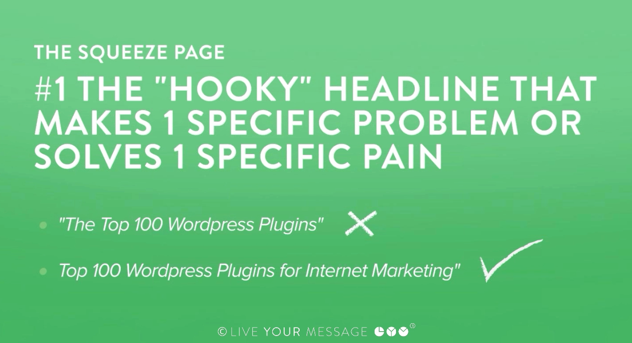
Internet Marketer Andy Jenkins didn't name his eBook "The Top 100 Wordpress Plugins." He named it the "Top 100 Wordpress Plugins for Internet Marketing". Simply by adding the words "for Internet Marketing," the report goes from being a generic one-size-fits-all tech resource to a specific, pain-solving, must-have guide for internet marketers. Do you see the difference?
So - to sum up - if you take away nothing else from my entire session about copywriting -- I want you to take away THIS.
The best copywriting is about resisting the urge to try to solve ALL of the visitors problems in one fell swoop. That's the biggest mistake I see people making.
Here's an example.
A good friend of mine has just launched a platform around helping people find and face the fears that are holding them back in life. He's SO passionate about this because he's worked through a lot of fear in his own life and found some of the freedom that lies in facing that fear and letting it go. It's really important work that could help a lot of people.
He came to me and asked my opinion on the best way to get people in the front door. What kind of squeeze page or offer is going to inspire someone to leave their email address?
When we talked, he was stuck on offering them a 20-page manifesto he'd written talking about the whole fear problem and the cost it's having on society and his solution for fixing it.
While that's a fine thing to have for later - it's nothing I wanted him to let anywhere near the front end of his business. I told him: people just don't have time for that. I advised him to solve one hyper-specific problem for his visitor. I told him to think about this - if fear was holding someone back, what's the pointiest, most painful way that fear could manifest in their life that most people could resonate with?
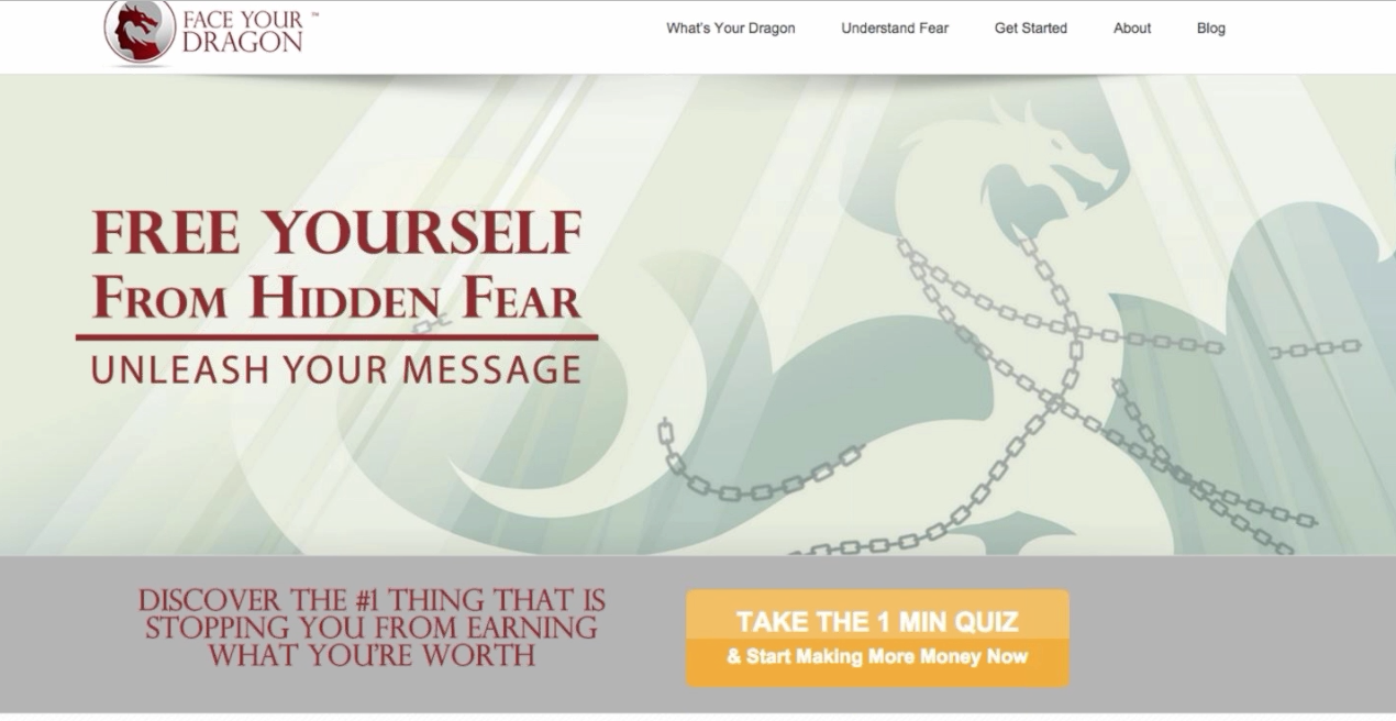
After some brainstorming, we came up with the idea of offering a quiz where people could discover the #1 thing that's REALLY stopping them from earning what they're worth. It's just a 1 minute quiz -- just a handful of questions -- and he asks them for their email address at the end. And it's working really well for him.
So I'm going to end this section on Squeeze Page Headlines by paraphrasing the great Nelson Mandela: If you talk to someone in a language they understand, that goes to their head. If you talk to them in their language, that goes to their heart.
OK - now let's talk about the most important thing next to your headline -- your bullet points.
Why do we need bullet points?
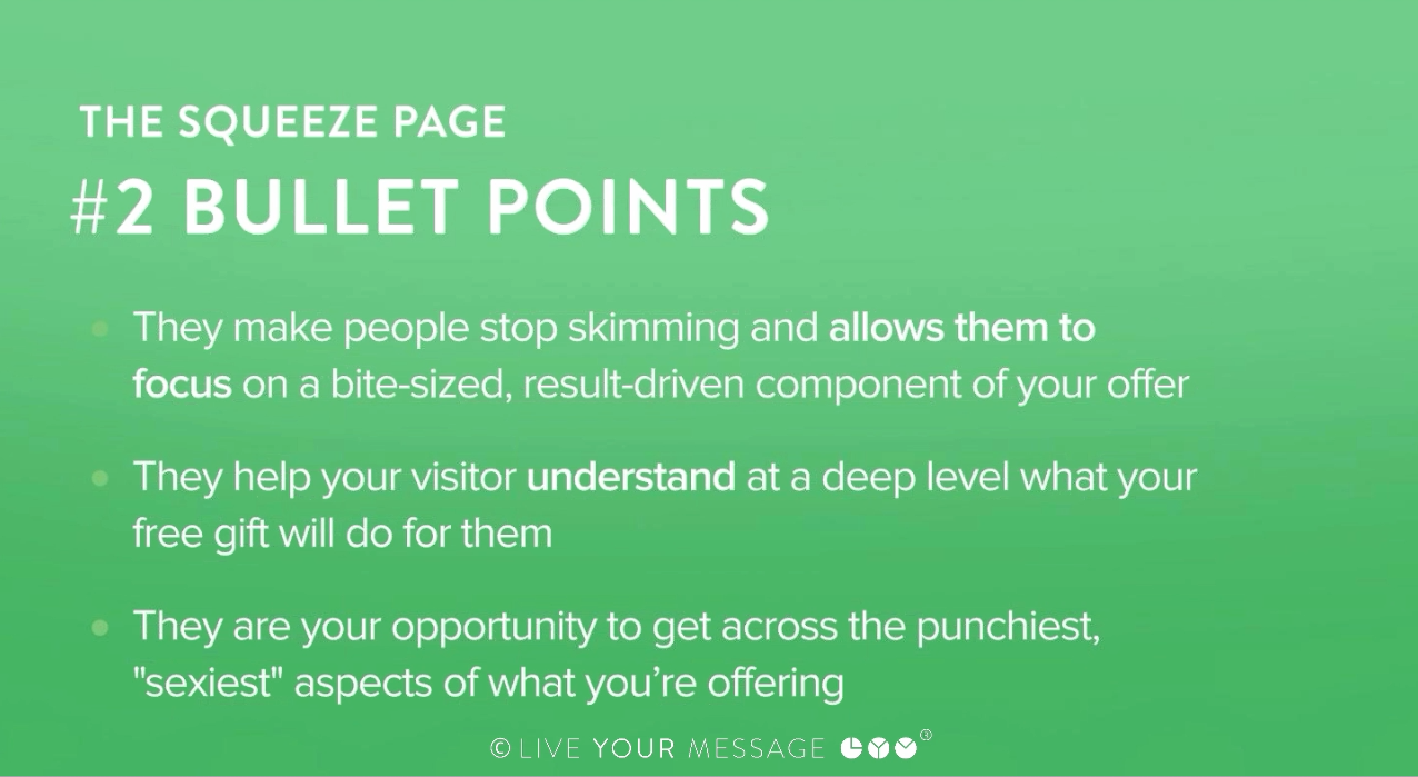
Bullet points are crucial because ...
- They make people stop if they're skimming and they get them to focus on a bite-sized, result-driven component of your offer. This is critical stuff, because as readers take in your sales page (or video) they're going to have a lot of information flowing towards them.
- Bullet points give them some relief from long paragraphs of text and because of that, readers tend to give them extra attention.
- Bullet points help your visitor understand at a deep level what your free gift will do for them by painting the most amazing picture that they've ever imagined.
- Bullet points are your opportunity to get across the punchiest, "sexiest" aspects of what you're offering and stack them one on another on another until you've delivered so many "I've got to have that" moments that your reader decides to make the purchase.
So let's talk about what kind of bullet points trigger positive emotional responses to your product.
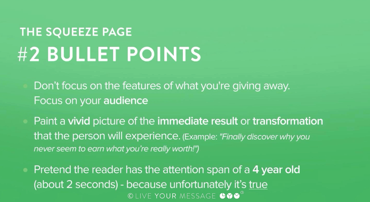
First rule of great bullets is --
- Don't focus on the features of what you're giving away. No one cares how long it is or how it's going to be delivered to them. Focus on your audience, what they want and how they'll benefit.
- Paint a vivid picture of the immediate result or transformation that the person will experience -- like our example of a few moments ago: "Finally discover why you never seem to earn what you're really worth!"
- One trick that works for me when writing bullets is to pretend the reader has the attention span of a 4 year old (about 2 seconds). Picture your prospect as the laziest person in the world looking for ANY reason to stop reading. Motivating them to register is difficult... unless it's CLEARLY demonstrated that it's worth it for them to do so.
I'm going to show you how you can use bullets in your landing page copy that get those lazy prospects to TAKE ACTION.
Let's look at an example...
The "Best in your Situation" Bullet
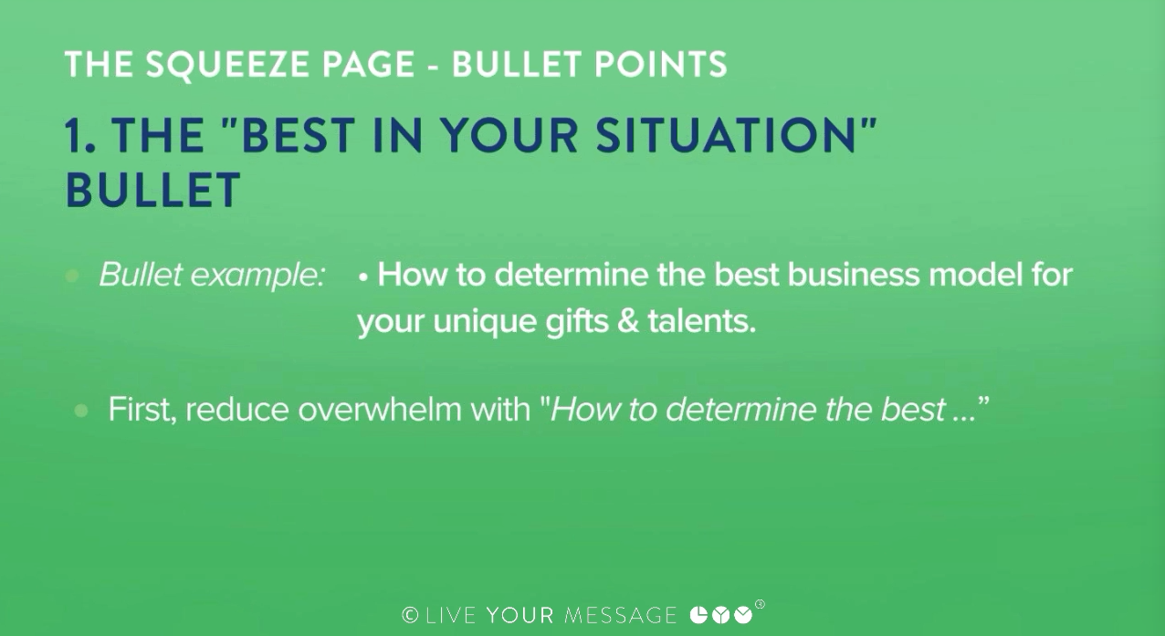
Here's an example of that bullet in action: "How to determine the best business model for your unique gifts and talents"
Ok, so this bullet point does two things:
First, it promises you "How to determine the best ...", which is important because your readers are often overwhelmed by choices. They worry that they'll take the wrong path, or worse yet, never decide on a path to take at all.
Letting your readers know that you'll help them figure out the best approach is powerful, anxiety-reducing stuff.
Second, this bullet point effectively personalizes the approach by saying "for your unique gifts and talents." This further cements the idea that this benefit of the product will "work for me" in my situation. That's another anxiety reducer.
So if your offer contains something that can help people make decisions based on their personal situation, this is a powerful type of bullet point to offer.
The "Stop Losing X" Bullet
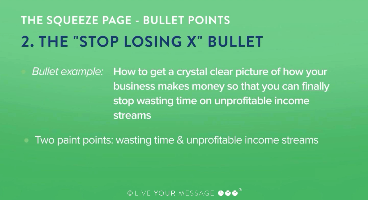
How to get a crystal clear picture of how your business makes money so that you can finally stop wasting time on unprofitable income streams
This bullet is longer than I'd like it to be, but it still does the job. It leverages two pain points - wasting time and unprofitable income streams - and points to a solution (clarity).
This style of bullet point acknowledges your existing problems but promises to help them finally stop. Note the use of "finally" to create a stronger emotional response.
The lesson here: Don't just say "here's something cool about my offer" - let your reader know that one (or more) of their pain points can stop because of it.
The "Counter-Intuitive" Bullet
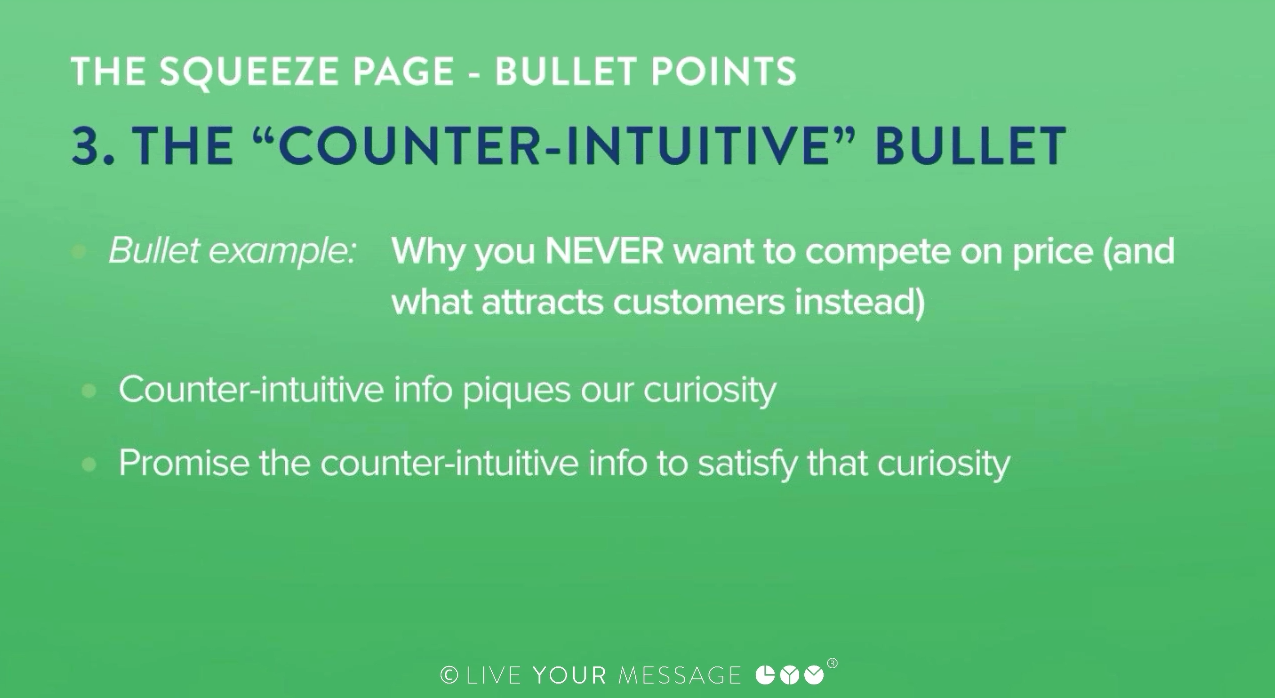
An example of this one is -- "Why you NEVER want to compete on price"
This kind of bullet also taps into two powerful psychological factors.
The first is a counter-intuitive stance that piques curiosity. We're conditioned to compete on price because we're bombarded by discounts and deals all the time, compounded by the fact that we all tend to feel some level of insecurity around pricing.
So hearing that price isn't what we should compete on makes us wonder, "ok, then what's the alternative?" We're curious and left hanging, which makes us want to buy and find out.
Second, you want to promise they'll get the counter-intuitive piece of info you have for them if they take action.
By saying you should never do what the reader is likely to be doing, you nurture a sense of need for the real solution, and the reader's hand starts reaching for their VISA card or the Register button.
Of course, you need to deliver the goods with this one - you can't just say this for the sake of creating tension or you'll lose trust (and rightly so). But if you have counter-intuitive points in your offer this is a powerful way to get the value of your information across.
The "Avoid These Mistakes" Bullet
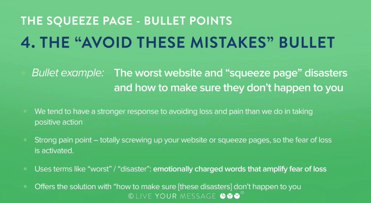
Here's an example: The worst website and "squeeze page" disasters and how to make sure they don't happen to you.
This kind of bullet is incredibly powerful because we tend to have a stronger response to avoiding loss and pain than we do in taking positive action. This is a solid bullet and I wouldn't change a thing, because it does three things:
- First, it identifies the pain point - totally screwing up your website or squeeze pages, so the fear of loss is activated.
- Second, it uses terms like "worst" and "disaster" - emotionally charged words that amplify the fear of loss.
- Finally, it offers the solution bridge with "how to make sure [these disasters] don't happen to you."
Being able to say "this will help you avoid pain" is an incredibly strong selling point, especially if you amplify the pain with effective trigger words. Now, I'm not recommending you create a false sense of fear - that's not cool - but if you know there's a particularly powerful pain point that you can help your reader avoid, this is a great strategy.
(And by the way, I've had my share of website and squeeze page "disasters," so I can relate.)
The "Fascination" Bullet
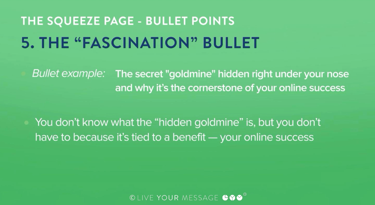
Example: The secret "goldmine" hidden right under your nose and why it's the cornerstone of your online success
This bullet gives nothing away and actually makes you wonder "what are they talking about?" What's hidden right under my nose?
You don't know what the "hidden goldmine" is, but you don't have to because it's tied to a benefit - it's said to be the "cornerstone of your online success." The whole point of this bullet is to reveal an important benefit and make you wonder what it is.
If something sounds juicy enough, you just have to find out what it is. If you have special terminology in your offering, creating a fascination bullet can be a powerful conversion tool.
But you can use it in other ways as well. When I was writing bullets for a webinar Marisa did last year, I wrote a bullet point that went something like "Find out what Marisa really thinks of the big design agencies." Readers were left wondering what juicy information was in that interview. --
So now you know five ways to make high-conversion bullet points, but you can go further ...
The next time you see a squeeze page or opt-in page, look through the bullet points and ask yourself which ones seem most compelling to you.
Then copy/paste them into a "swipe file" you can look at later for inspiration and examples when it comes to creating your own bullet points.
Now I'd like for you to write a couple of bullets of your own to sell your free gift or thing you're giving away on your squeeze of opt-in page.
1
