
OK, so first, what the heck does "responsive" mean?
In a basic sense, "responsive" means that the page will be responsive to the screen it's being displayed on, and be able to adjust itself automatically to give the optimal experience for your visitors.
View it on a large screen, it will show that version of the page. View it on a smaller, cell phone screen, and the page will adapt to that screen, and give the visitor a different viewing experience.
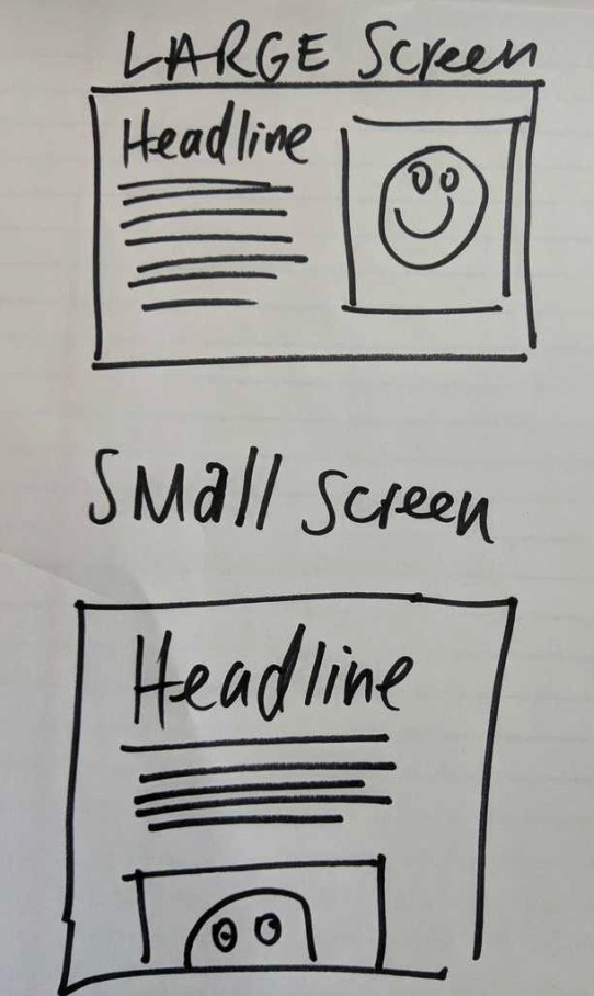
The normal method for adapting to smaller screens is to simply "stack" your page elements one on top of another. Here's an artist's (my) rendering of what that means:
We've set things up so that your Heroic pages should automatically adapt pretty reliably as the screen size diminishes in size, however, it can't always get it 100% right. Sometimes, it's going to need a little fine-tuning from you to really nail it.
Why is this so important?
The statistics now show that more than HALF of all web traffic now comes from mobile devices such as cell phones and tablets.
What's more -- mobile internet browsing now exceeds desktop usage everywhere in the world.
That means people are browsing your site on-the-go from their smartphones and from their couch with their tablets.
Think back to the last time you went to a website on your cell phone and it clearly wasn't designed for mobile. You mess around with all those fiddly dropdown menus and try to navigate to the right page only to choose the wrong page because your fingers just couldn't tap that tiny little button no matter how far you zoomed in?
How long did it take you to give up and hit the back button?
Right. That's why this is so important.
How to tweak your page appearance on different screen sizes
Check out this article: Tweaking page appearance for the different screen sizes
What's adjustable on each screen size?
We've created a list of all of the things that are adjustable and changeable on each screen size.